
The Little App on smoothing and covariates has two distinct (but related) purposes.
- to introduce regression
- to bring covariates into the picture
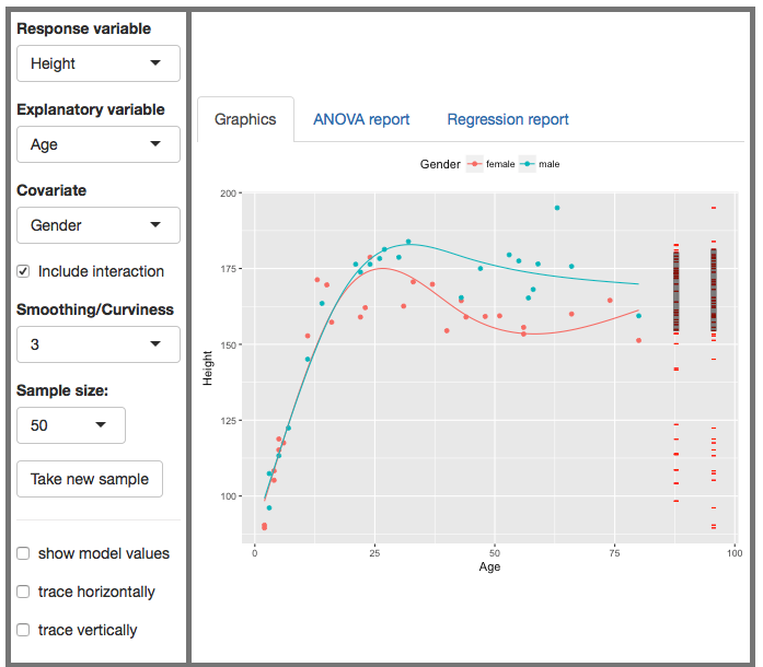
A covariate is a potential explanatory variable, perhaps one that you’re not directly interested in but which you think might play a role in the system. In the following snapshot of the app, height is the response variable, age is an explanatory variable. But also gender is an explanatory variable. That is, there are two explanatory variables. The word “covariate” gives us a way to refer to the two variables separately: the snapshot shows height versus age with gender as a covariate.
Orientation to the app
Once again, we have the familiar format of graphic: a scatterplot with the response variable on the y-axis and an explanatory variable on the x-axis. You also can have a covariate, which will be displayed as color. (All the covariates available in the app are discrete-valued. Covariates can also be continuous variables, but that’s harder to show graphically.)
There are controls to select the variables for display, set the sample size n, and take a new sample. The other controls – interaction, curviness – will be introduced as we need them.
A new aspect to the graph is the red annotations to the right of the graph. (These also appear in the Little App on ANOVA.) The rightmost set shows the response variable values. The values are gathered in one spot to make it easier to see the total variation in the response variable. The length of the black shaded bar is the standard deviation of the response variable.
The stack of bars just to the left of the response-variable annotations shows the model value for each data point. To see what that means, play with the check boxes at the bottom of the control list. (Using small n will make it easier to see what’s going on.)
Teaching with the app
The snapshot above is not where you want to begin.
Simple regression
When we have an explanatory variable that is categorical, it’s natural to model the response variable as its typical value for each level of the explanatory variable. Often, we use the mean to indicate “typical” and that’s what we’ve been doing.
When the explanatory variable is quantitative, we model the relationship as a function of the explanatory variable treated as a continuous quantity. The simplest such function is a linear function: a straight line.
The little app lets you look at a variety of response and explanatory variables, automatically displaying the fitted function in each of them.
It’s traditional in intro stats to focus on how the line is fit to the data: residuals, sum of square residuals, and so on. This app is not about that.
Instead, use the fitted lines to talk about the relationship between the response and explanatory variable.
- The vertical position of the line at each value of the explanatory variable is often in the middle of the response values for the cases near that particular explanatory level.
- The slope of the line is a description of the relationship in terms of how much change in the model response value results from a unit change in the explanatory variable.
- The slope is a physical quantity, since both the response and explanatory variables are physical quantities. The unit of the slope is the ratio of the units of the response variable to the explanatory variable. For instance, when looking at height versus age, the slope has units cm/year.
- We often like to talk about the relationship as if it were a causal one, e.g. change a persons age by 10 years and their height will change by so many centimeters. Sometimes the relationship is causal. But sometimes it just means the variables are connected in some way, and that neither variable causes the other.
- Positive slopes and negative slopes are both possible.
- You can also have slopes that are practically zero. This indicates that there is not a relationship between the two variables, causal or otherwise.
- It’s an important matter in statistics to be able to say whether a “small” slope ought to be regarded as no slope at all. We often speak of this using the idea of an “accidental” slope, by which we mean that if we collected a different sample, there would be a good chance that the line fitted to that sample would have a slope of the opposite sign.
- The magnitude of the slope is an important indicator of the strength of the connection between the variables being displayed.
You can illustrate each of these points by an appropriate choice of response and explanatory variable. Draw new samples repeatedly to illustrate how the slope can depend on the particular sample.
A second explanatory variable: a covariate
As a general rule, outcomes in the world are related to multiple variables. This app lets you use a second explanatory variable, which is called a covariate. To keep things simple here, that’s always a categorical variable, but the mathematics (if not the graphics) works just the same when the second explanatory variable is quantitative.
When a covariate is included, there’s a separate slope for each value of the covariate.
Sometimes introducing a covariate has little effect on the slope from what you got without the covariate. But sometimes introducing the covariate has a large effect, either steepening the slope or making it closer to zero or even reversing the slope from positive to negative or vice versa.
Statistics distinguishes between two ways of including a covariate, with and without an interaction. Using an interaction means that the functions for each level of the covariate can have different slopes. Without an interaction, the function for all levels of the covariate are forced to have the same slope.
The explained part of the variance and R².
The slope gives one way to describe the relationship between the response and explanatory variables. Another description is about how much of the variation in the response variable is captured (or “accounted for” or “explained”) by the explanatory variable. This second description is called R-squared: R².
The annotations on the far right of the graphic show the values of the response variable for all the cases being displayed in the graph. As you can see, these are spread out vertically. That’s because the response variable is plotted on the vertical axis. For each and every case in the plot, there will be a red bar positioned at the same y-value as that case.
The response values are spread out because there is variation from case to case. That’s why we call the quantity a variable. There is a standard way to describe the amount of variation: the standard deviation of the values. This standard deviation is displayed as the length of a vertical black bar over the red annotations. Refer to the y-axis to figure out how long the bar is in the units of the response variable.
A model that captured all of the variation in the response variable would go through each and every case plotted in the graph. A straight line can hardly do this. Indeed, even a smooth curve isn’t likely to accomplish this while staying smooth. And even if a covariate is included in the model, the model function will not typically go through every case in the plot.
The failure of the model function to pass through every case can be stated another way: for each case, there is typically a vertical deviation between the actual case and what the model value would be for that case. You can show this deviation in the graphic by checking the show-model-values and trace-vertically boxes.
Suppose that each case, instead of having it’s actual value for the response variable, were given the value according to the model. These model values would also vary from case to case in accordance with the slope of the model function fitted to the data. Those model values are shown in the leftmost red-line annotations next to the annotations for the actual response values.
By the nature of fitting a function to the data, for some cases, the actual response values will be larger than the corresponding model value for that case. Similarly, for some cases, actual response value will be less than the model value. That is, the model values tend to be in the middle of the actually values.
A standard measure of how much variation the model captures is the spread of the model values as indicated by their standard deviation. The standard deviation of the model values is shown by the length of the black bar shown over the red model-value annotation.
Since the model values are in the middle of the range of the actual response values, the variation in the model values is always less than the variation in the actual response. Stated another way, the standard deviation of the model values is less than the standard deviation of the actual values. The black bar over the model values is shorter than the black bar over the actual values.
One measure of how much of the variation in the response variable is captured by the model is the ratio of the standard deviations of the model values and actual values. This ratio is called R (capital R). If R is zero, then the model tells us nothing about variation in the response variable. (And, in order for R to be zero, the slope of the model would have to be zero.) The mathematical limit is that R=1, meaning that the model captures all of the variation. (Such a model would have to go exactly through each and every one of the cases.) Typically, R is between zero and one: the model accounts for some but not all of the variation in the response variable.
For good mathematical reasons, rather than using R itself, we usually describe models using the square of R, that is, R². (Instructor note: the good mathematical reason is related to the Pythagorean theorem. For models fit with least squares, the sum of squares of the response variable will equal the sum of squares of the model values plus the sum of squares of the case-by-case residuals.)
R² can be used as a description of the strength of the relationship between the response and explanatory values viz a viz all of the other factors (random or otherwise) that influence the response value.
Another major use for R² is to guide the construction of models. Does adding a covariate actually improve the model? One answer is given by R². When we add in the covariate to the model, R² will go up. There’s a good theory (see ANOVA) about how much of an increase in R² is expected when the explanatory variable is actually related to the response.
A simple-to-present version of this theory is displayed in the adjusted R² that appears in the regression report. Adjusted R² is constructed so that, according to the theory, on average it should not increase when adding to the model a covariate that has nothing at all to do with the response variable.
You’ll be able to find in the NHANES data examples where R² is big, and where it’s small. You’ll also find examples where adding a covariate increases R² (this is generally the case) but doesn’t increase the adjusted R².
When you are displaying a relationship that seems substantial, make sure to talk about the story that the regression function tells: what it’s slope means in everyday terms, what the spread among the different levels of the covariate means in everyday terms, and so on.
Smoothing
You’ve put up a display with height as the response and age as the explanatory variable. Like this:
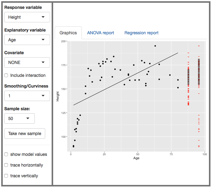
Instructor: All of you know about height and age. The data show the familiar pattern: at a young age, people are very short, around 100 cm. Over the next decade or so, the height increases rapidly to about 170 cm. After that, there doesn’t seem to be much relationship between age and height. Also on the display is the best straight-line model of height versus age. Does it match up with the real-life story about age and height?
Student: But the line says that height increases with age, even when you’re pretty old. That’s not true.
Instructor: Good point. A straight-line function has a slope that stays constant, it can’t show fast growth (a steep slope) for one age and little-or-no growth (a shallow slope or zero slope) for another age. If you’re pattern is to capture the whole pattern of human growth, from childhood through adulthood and old age, the straight line model doesn’t seem appropriate. But models don’t have to be straight lines: they can be any shaped function we like. What shape would you recommend?
Student: Well it’s really more of a parabola.
Instructor: Yeah. OK. You’re thinking of functions as polynomials: linear, parabolic, cubic. But in statistics we’ve got much more flexibility than polynomials. Come up to the board and draw a function, and shape you want, that you think would be a better model than the straight line.
[The student draws something. Maybe a line that bends at about 20 years of age. Maybe a smooth curve. This is an opportunity, if you like, to ask why the student didn’t draw a jagged line that connects the dots. Feel free to do that yourself and brag that it’s closer to the data. Discuss which is better. Then put up a new sample, or a sample with much larger n. Show that the jagged line seems kind of made-up when there’s more data involved. But the smooth curve or the broken line are still pretty good.]
Instructor: I’m going to show you how to get the compute to draw a smooth, bendy curve. But before I do that, I want to measure how good the straight-line model is. Then, when we have a curved model, we can find out if it really is any better than the straight line.
Review R². The ratio of the standard deviation of the model values to the standard deviation of the height values is R. Square that to get R². You can also show them the regression report. In the snapshot shown above, the R ratio is about 2⁄3. So R² is about 4⁄9 which works out to about 0.45.
Play with the curviness selector. Each of these is also a regression model, just not one that has to be a straight line. It can be steep in some places and level in others. Which one do you like?
When you’ve settled in on a consensus, compute and display R² for that model. Is the curvy model really better? Chances are: Yes! It will certainly be better for large n.
Instructor: Now is age the only thing that accounts for a person’s height?
You see where this dialog is heading. There are many factors that might influence height: nutrition, health, and so on. But also we know that men tend to be a little taller than women, on average. Include gender as a covariate. (Use large n. You might have to increase the curviness parameter to get a good match.)
Note that the model is saying that at all ages, women are shorter than men. Show that the vertical difference between the curves is constant at all ages.
Instructor: This is because we told the computer to make the model depend on age, and to depend on gender, but we didn’t tell it to depend on gender differently at different ages. That sort of situation, where the impact of one explanatory variable is modulated by another explanatory variable is called an interaction. Include the interaction in the model and (for large n and high-enough curviness) you’ll see that the models for males and females split apart only in the late teens and adulthood. For children, females and males are about the same height, on average.
Go back and review how R² changes as we make the model more curvy, add in covariates, include the interaction.
Explore a few scenarios of explanatory variables and covariates that probably don’t have much connection to height, e.g. total cholesterol and work status. We’re going to have to figure out a criterion that can tell us when there isn’t a relationship to be seen from the data.
Of course you don’t have to use height as the response variable. For example, we might look at blood pressure versus weight, or number of days of depression versus income (on the poverty scale) and work status.
For instructors
Instructors often ask:
- Why is it called regression?
- What about the correlation coefficient, r?
“Regression”
As for “regression,” that’s an unfortunate accident of history. In the early days of statistical modeling, it was noticed that in regression models of two similar quantities, the fitted slope was always less than 1. For instance, Francis Galton noticed that regression the heights of adult sons on the heights of their fathers gives a slope less than one, even though the heights are measured in the same units and even though we expect sons’ heights to vary as much as father’s heights. Another famous example is modeling this year’s profits (or loss) by businesses versus last years’.
Before it was realized that a slope less than one is a consequence of the mathematical procedures, there was speculation that there is some biological or economic mechanism at work. Galton wrote about “regression to mediocrity,” meaning that a father’s sons’ heights would tend to be closer to the mean of all heights than the father’s height itself.
Nowadays, the technical meaning of “regression” is simply “a model that relates explanatory variables to a quantitative response.” Maybe “Q-model” would be a better term. By the way, “a model that relates explanatory variables to a categorical response,” is called a classifier.
Little r
The correlation coefficient, little r, is closely related to big R. Little r results when there is one quantitative response variable and one (and only one) explanatory variable which is also quantitative. In such a situation, little r will be exactly the same as big R, except that big R will alway have a positive sign.
Little r encodes two things:
- Through its magnitude, how strong the relationship is between the variables. This is the same as big R.
- Through its sign, whether the relationship is such that an increase in the explanatory variable is associated with an increase (positive sign) or decrease (negative sign) of the response variable. But big R is always positive and so doesn’t carry this information.
Big R is more general than little r. Big R applies to all sorts of regression models with one or more explanatory variables and where the explanatory variables can be either quantitative or categorical.
What about the sign of little r. How can we know whether a relationship is positive or negative by looking at big R?
The answer is that “positive” or “negative” only makes sense when there is only one explanatory variable and when it is quantitative. When there are multiple quantitative explanatory variables, some can have a positive relationship while others have a negative relationship. It can hardly be said that the model itself has a positive or negative relationship, just the slopes with respect to the various explanatory variables.
Rather than talking about the sign of little r, better to talk about the slope itself, using correct physical units. It’s the slope that guides thinking about how substantial or important the relationship is in the real world. The slope can be positive or negative, just like little r, but the slope also has a magnitude describing how much change in the response variable is associated with change in the explantory variable.
In my view, it would be better if we left little r out of the introductory curriculum, saving it for courses about statistical history or courses that involve multivariate gaussian distributions, covariance matrices, and such.